UX RESEARCH | UX DESIGN | UI DESIGN | USABILITY TEST | DEVELOPMENT
University of Rochester
Overview: A complete overhaul of the University's main website, which is visited by millions of people each year. It was decided to build the entire main portion of the site using custom HTML, which meant that all enhancements and features had to be done by hand.
Role: Director of Design/Development
Date and Timeline: 2019/2020 - 10 Weeks +
Toolkit: Sketch, Miro, Asana, Adobe

Project Outline
Meliora - Ever Better
The end-to-end redesign of the flagship website with the dual goal of increasing prospective student enrollment and elevating the university’s reputation as a leader in research and innovation. The project began with extensive stakeholder workshops across Admissions, Research, and Academic Affairs to align on strategic priorities and user needs.
We restructured the information architecture to create clear, student-focused enrollment pathways while also surfacing high-impact research stories and faculty achievements. The new design system emphasized accessibility, responsive layouts, and data-driven content strategy, resulting in the increase of traffic, stronger engagement from prospective students, and broader visibility for the university’s groundbreaking research.
The Client
For a project like the University of Rochester Flagship redesign with a focus on driving enrollment and highlighting research, the client in our mind was:
Primary Client:
University of Rochester leadership - the Office of Admissions & Enrollment Management (since enrollment growth was a core goal) in partnership with University Communications / Marketing (responsible for brand, messaging, and public-facing presence).
Secondary Stakeholders:
Office of the Provost / Research Division (ensuring research excellence and faculty innovation were prominently featured).
IT / Web Services (for infrastructure, accessibility, and technical feasibility).
University Advancement / Development (since the website also impacts donors, alumni, and institutional reputation).
The official client would be University Communications in partnership with Admissions, but the redesign also had secondary clients across Research, Marketing, and IT who shaped requirements and outcomes.

The Users
🎯 Primary End Users (Core Design Focus)
Prospective Students & Families
Goal: Drive enrollment by showcasing academic programs, admissions pathways, student life, and financial aid.
Design Needs: Clear navigation, compelling storytelling, strong calls-to-action (apply, visit, request info).
Faculty, Researchers & External Partners
Goal: Highlight the university’s exceptional research and innovation.
Design Needs: Dedicated research hubs, faculty profiles, publication access, and visibility for funding or partnerships.
🌐 Secondary End Users (Important, but not the main driver)
Alumni & Donors
Goal: Stay connected, informed, and inspired to contribute financially or through advocacy.
Design Needs: Engaging news, impact stories, and easy donation pathways.
Current Students & Staff
Goal: Access resources, news, and internal services.
Design Needs: Quick links, campus updates, and portals to internal systems.
The Business Goals
Increase Enrollment
Drive more applications and inquiries from prospective students (undergraduate and graduate).
Reduce friction in the admissions journey with clearer pathways and calls to action.
Elevate Research Reputation
Showcase world-class research, science, and faculty achievements to strengthen the university’s prestige.
Attract partnerships, funding, and top-tier faculty/research talent.
Strengthen Brand Identity & Differentiation
Position the University of Rochester as both academically rigorous and research-driven.
Create a digital presence aligned with the institution’s values and long-term strategy.
Improve User Engagement & Experience
Redesign information architecture to make content more discoverable for diverse audiences (students, parents, faculty, donors).
Implement accessibility and responsive design to serve all users across devices.
Support Fundraising & Alumni Engagement (secondary goal)
Highlight impact stories and make donation pathways seamless.
Showcase alumni success as proof points for the university’s value.
Future-Proof Digital Infrastructure
Create a scalable design system and CMS to streamline updates and reduce long-term maintenance costs.
Enable cross-department collaboration (admissions, research, advancement, IT).
The Problem
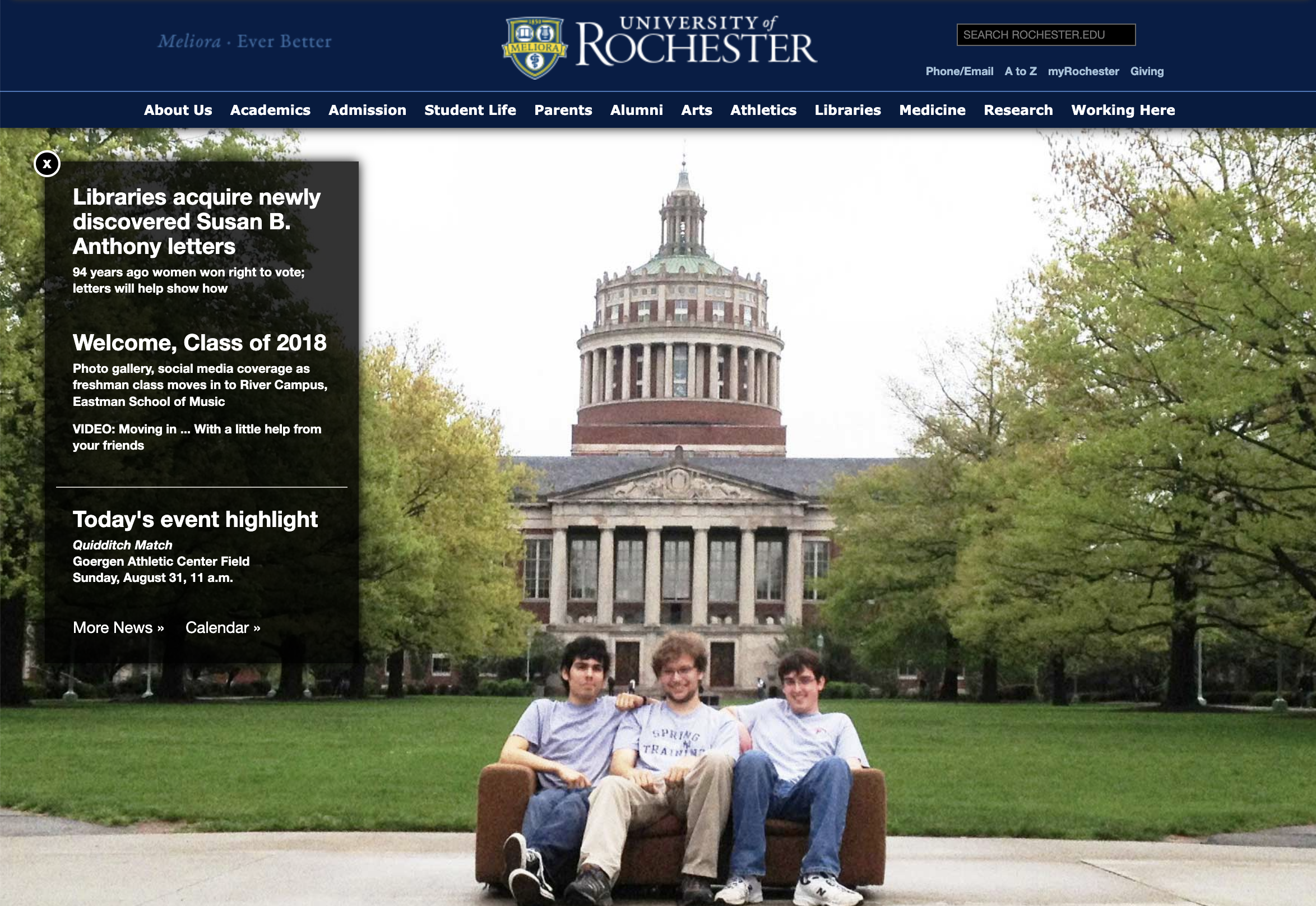
The site is desktop-first, navigation-heavy, and content-cluttered, making it poorly suited for mobile users and ineffective in driving strategic goals (enrollment + research visibility).
Problem
Poor Information Hierarchy
News/events dominate homepage.
No clear enrollment or research pathways.
Multiple priorities compete equally.
Accessibility Issues
Poor text contrast on hero image.
Small fonts and overlays difficult to read.
No mobile accessibility consideration.
Outdated Visuals & Content
Hero image is generic and non-strategic.
Overreliance on text-heavy modules.
Outdated branding aesthetics.
Opportunity
Lack of Mobile-Friendly Design
Fixed-width, no responsive scaling.
Navigation unusable on small screens.
Text overlays unreadable on phones.
User Experience Gaps
Prospective students lack a clear journey.
Research visibility is buried.
Alumni/donor engagement not supported.
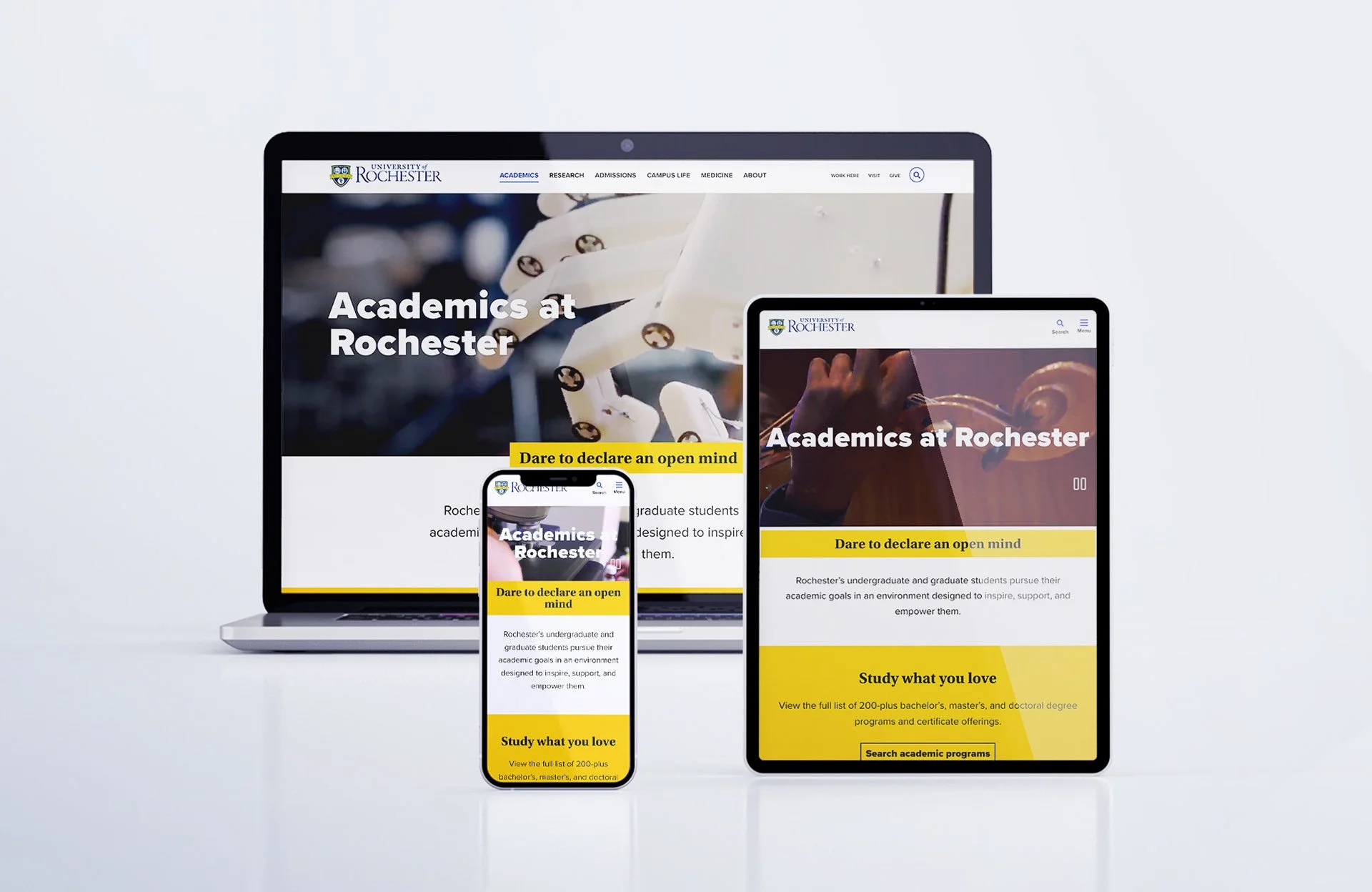
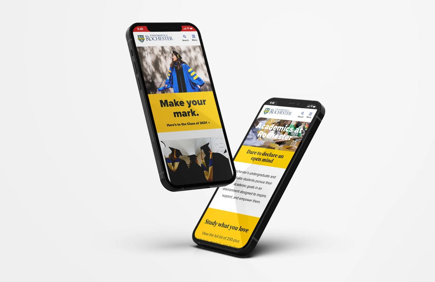
Mobile-First Redesign
Fully responsive, adaptive layouts.
Simplified navigation with hamburger menus.
Prioritize key tasks (Apply, Visit, Give) for mobile.
Navigation Challenges
Overloaded top bar with 10+ links.
Utility links mixed with primary nav.
No clear CTAs.
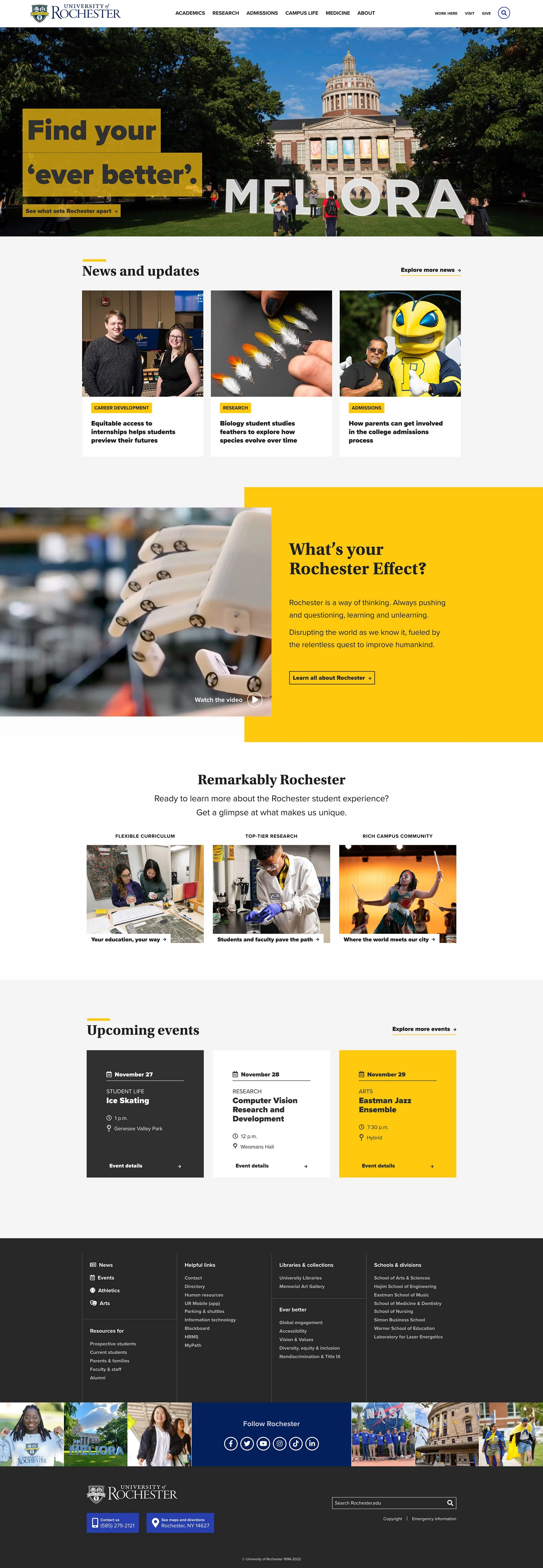
Strategic Content Prioritization
Dedicated enrollment funnel
Prominent research highlights and faculty spotlights.
Clear separation of news/events vs. recruitment content.
Streamlined Navigation
Organize into clear categories: Academics, Admissions, Research, Campus Life.
Add sticky CTAs (“Apply,” “Visit,” “Give”).
Inclusive Design
WCAG-compliant typography and color contrast.
Accessible navigation and ARIA tagging.
Ensure screen-reader and mobile-first accessibility.
Modernized Brand Expression
Hero visuals showcasing students, campus, and research.
Updated design system aligned with brand.
User-Centered Journeys
Tailored pathways for students, researchers, and donors.
Highlight faculty achievements and research impact.
Integrate alumni success stories
The Impact
The redesigned website delivered measurable outcomes aligned with the university’s business goals:
📈 28% increase in overall site traffic within the first year.
🎯 Higher prospective student engagement with admissions pages, resulting in increased applications and campus visit sign-ups.
🔬 Improved visibility for research, with a measurable rise in traffic to faculty and research pages.
✅ Accessibility compliance achieved, making the site usable for a wider audience.
🔄 Scalable design system implemented, reducing content update time and ensuring long-term consistency.
Research that changes our world
•
Research that changes our world
Research that changes our world • Research that changes our world
User Personas
-
![]()
“I just want to know what it’s really like to study here - and how I can apply without getting lost in a maze of links.”
Alex, 17, High School Senior
Prospective Undergraduate Student -
![]()
“I’m looking for a university where I can do meaningful research - show me your labs, faculty, and projects up front.”
Priya, 23, International Student
Graduate Researcher Applicant -
![]()
"I need to feel confident that my child will be safe, supported, and that this investment will pay off.”
Mark, 51, Parent of High School Junior
Parent of a Prospective Student -
![]()
"My research is world-class - but if it’s hidden three clicks deep, how will collaborators or students ever find it?”
Dr. Chen, 54, Assistant Professor of Physics
Faculty Member / Researcher


Colors Palette
Dandelion Yellow
Rochester Navy
Interactive Indigo
Color
Dandelion Yellow
Rochester Navy
Interactive Indigo
Grayscale Range
Hex
#FFC70A
#00205B
#283FAF
#252525
#F4F4F4
Purpose
Highlight CTAs and key information; use sparingly to draw attention
Foundation for headers, primary backgrounds, and strong visual branding
Reserved for interactive elements - links, buttons - not for decoration
Provide readable text contrast and subtle visual hierarchy
Consistency is essential: Sticking to these approved colors maintains a unified brand experience. Rochester Blue and Dandelion Yellow are deeply recognized as the university's signature colors.
Functional use of Interactive Indigo: This color is intentionally reserved to signal interactivity. It should not be used outside links/buttons to preserve clarity and usability.
Balanced visual design: Bright accents like Dandelion Yellow uplift UI appeal, but should be balanced with neutral backgrounds for professionalism and readability.
The Outcome
We delivered a mobile-first redesign that streamlined navigation and prioritized the user journey across devices. A clear enrollment funnel was established with persistent calls-to-action such as Apply, Visit, and Request Info. To elevate the university’s research reputation, we introduced modular storytelling blocks featuring faculty profiles, lab highlights, and breakthrough discoveries.
The new design system emphasized WCAG accessibility compliance and scalable components, ensuring consistency across departments. Together, these solutions modernized the brand experience while aligning the site with the university’s strategic goals of enrollment growth and research visibility.
Directly aligned digital design with strategic business goals (enrollment + research).
Created a future-proof, scalable system that serves multiple audiences.
Balanced brand storytelling with functional usability.
Demonstrated measurable results in traffic, engagement, and conversions.
Strengthened the university’s position in a competitive higher-education landscape.